Interaction and accessibility
Selectable cells
Heatmaps are visualizations first, so cells are not interactive by default. To let users
select a cell in a widget, return true from isInteractive():
protected function isInteractive(): bool
{
    return true;
}
Selecting a cell calls cellSelected() with its key. Selecting it again clears the
selection and calls cellDeselected(). What a selection means is up to you, for example
dispatching a Livewire event that another component listens for:
protected function cellSelected(string $key): void
{
    $this->dispatch('state-selected', state: $key);
}

protected function cellDeselected(string $key): void
{
    $this->dispatch('state-cleared');
}
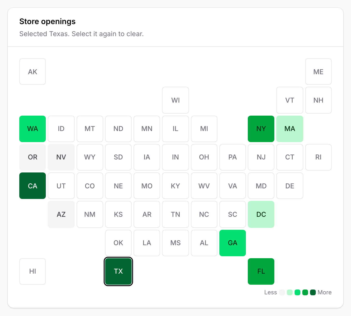
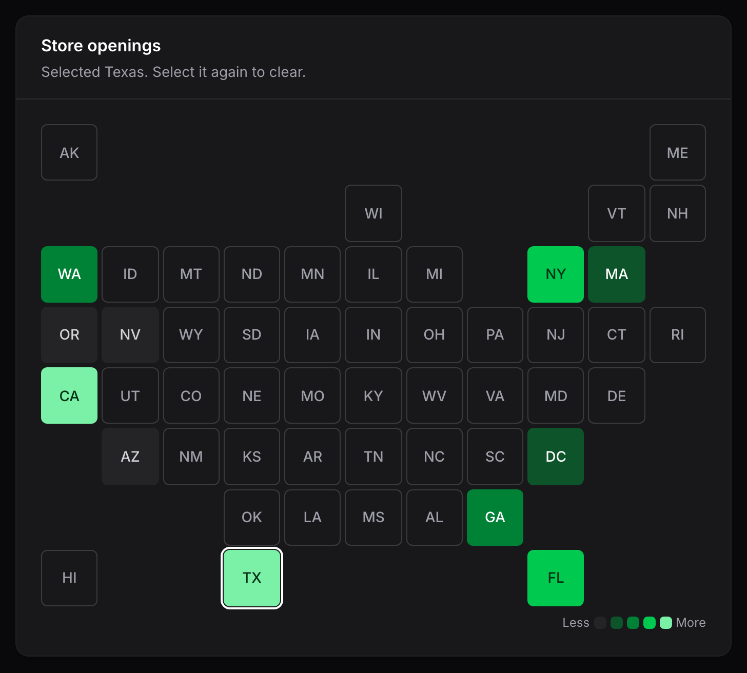
The key of the selected cell is available as the public $selectedCell property, which is
null when nothing is selected. The key always has the cell's own form: an ISO date such as
2026-10-06 for the calendar, or the tile key such as CA. One cell can be selected at a
time.
Selection is not tied to Filament dashboard filters or any other Thermal feature.
Keys come from the browser, so selectCell() ignores any key that is not a cell in the
heatmap, and ignores every key when the widget is not interactive.
Entries are read-only and do not support selection.
Keyboard
An interactive heatmap is a single stop in the tab order, however many cells it has:
- Tab moves focus into the heatmap, onto the selected cell or, without a selection, onto the first tile or the most recent day.
- Arrow keys move to the nearest cell in that direction, skipping empty positions.
- Home and End move to the first and last cell.
- Enter or Space selects or deselects the focused cell.
Focused cells show a visible focus ring, and the selected cell is outlined.
Screen readers
Every cell carries a text description that combines its label, its value and its level,
such as California, 1,284 leads, high activity or October 6, 2026, no data. It is the
accessible equivalent of the cell's color and tooltip, so no information depends on color
or hover alone.
The heatmap is announced as a group named after the widget heading or the entry label. The legend has a text description, and decorative labels such as month names and tile abbreviations are hidden from assistive technology because each cell's description already includes them.
Interactive cells are real buttons and announce whether they are selected. Non-interactive cells are not focusable and have no button semantics.
Other affordances
- Zero and missing cells differ in shape as well as color: zero is a solid cell and missing is an outline.
- In forced-colors modes, such as Windows High Contrast, cells keep their colors instead of being flattened to the system background.